Case study / 04
GR Fuel
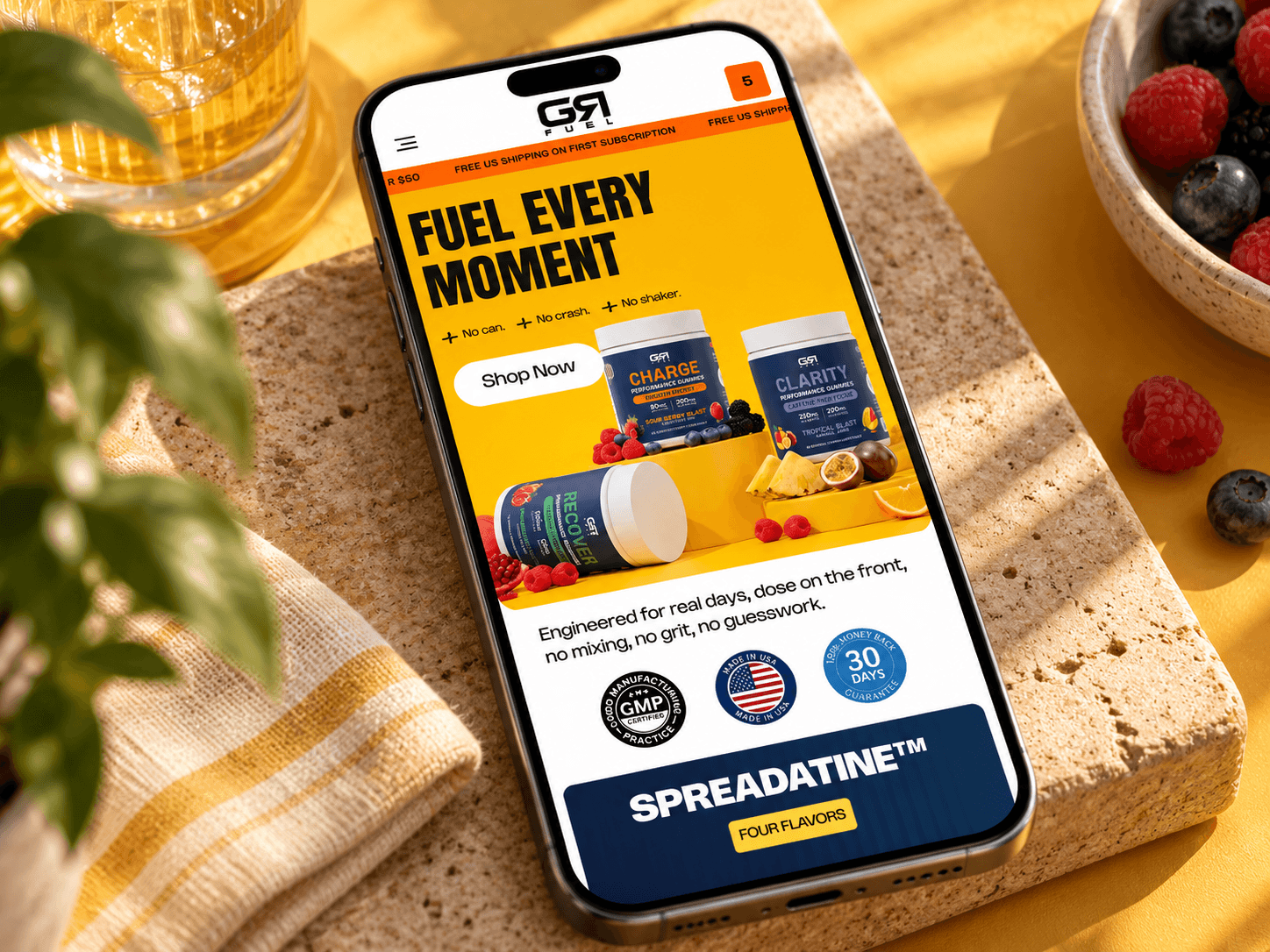
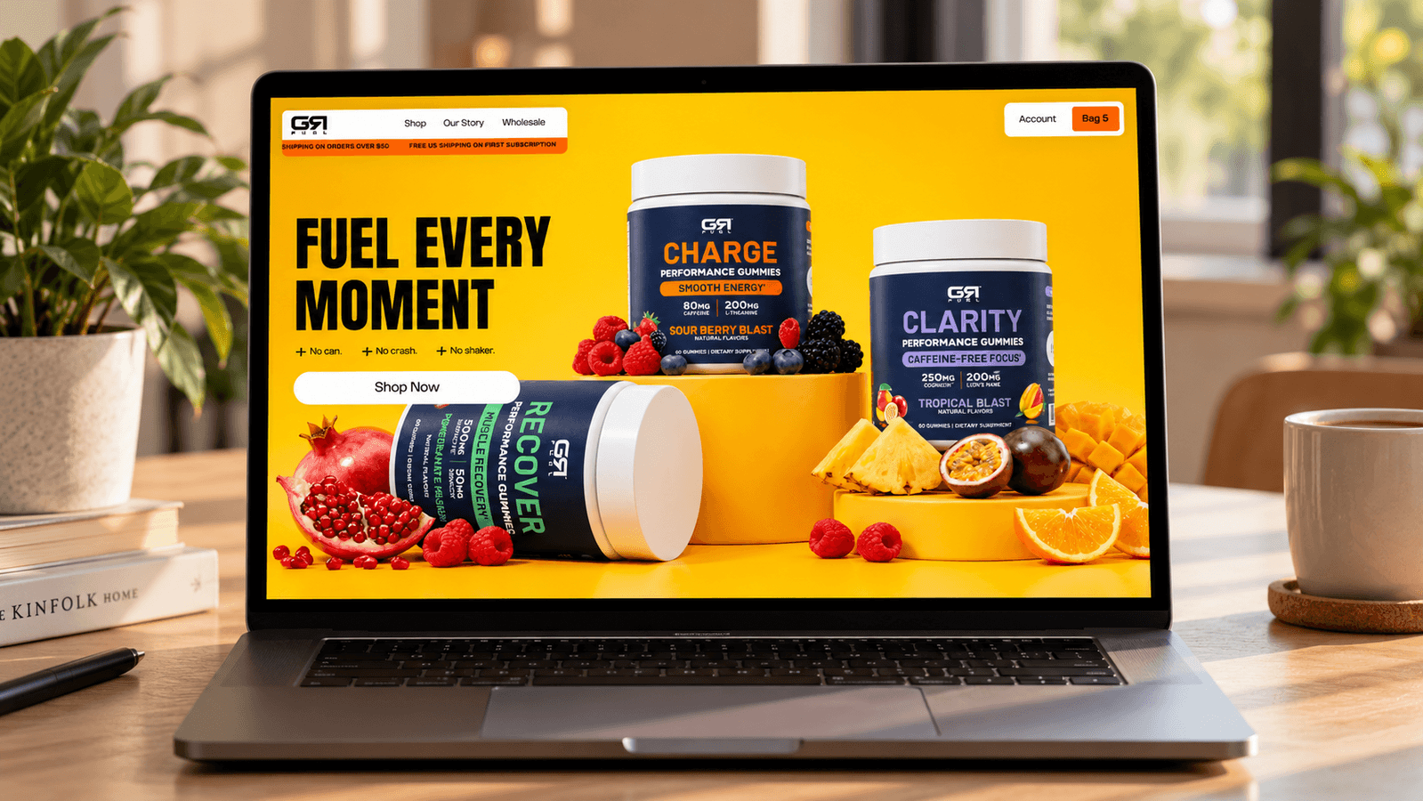
A bold, lifestyle-driven Shopify redesign for GR Fuel, transforming performance nutrition into an engaging everyday experience through vibrant product storytelling, transparent ingredient information, and conversion-focused shopping journeys.

Challenge
GR Fuel offers a fresh approach to performance nutrition with functional gummies and innovative products designed to support energy, focus, recovery, and everyday strength. The challenge was to create a digital experience that moved beyond the conventional fitness supplement aesthetic and connected with a broader lifestyle audience. With distinct products like Charge, Clarity, Recover, and SPREADATINE™, the website needed to clearly communicate what each formula does, who it is for, and how it fits into daily routines. Complex ingredient information, dosage details, and product benefits had to feel approachable without compromising credibility. Our goal was to build a stronger brand presence while making product discovery, education, and purchasing more intuitive across desktop and mobile.
Solution
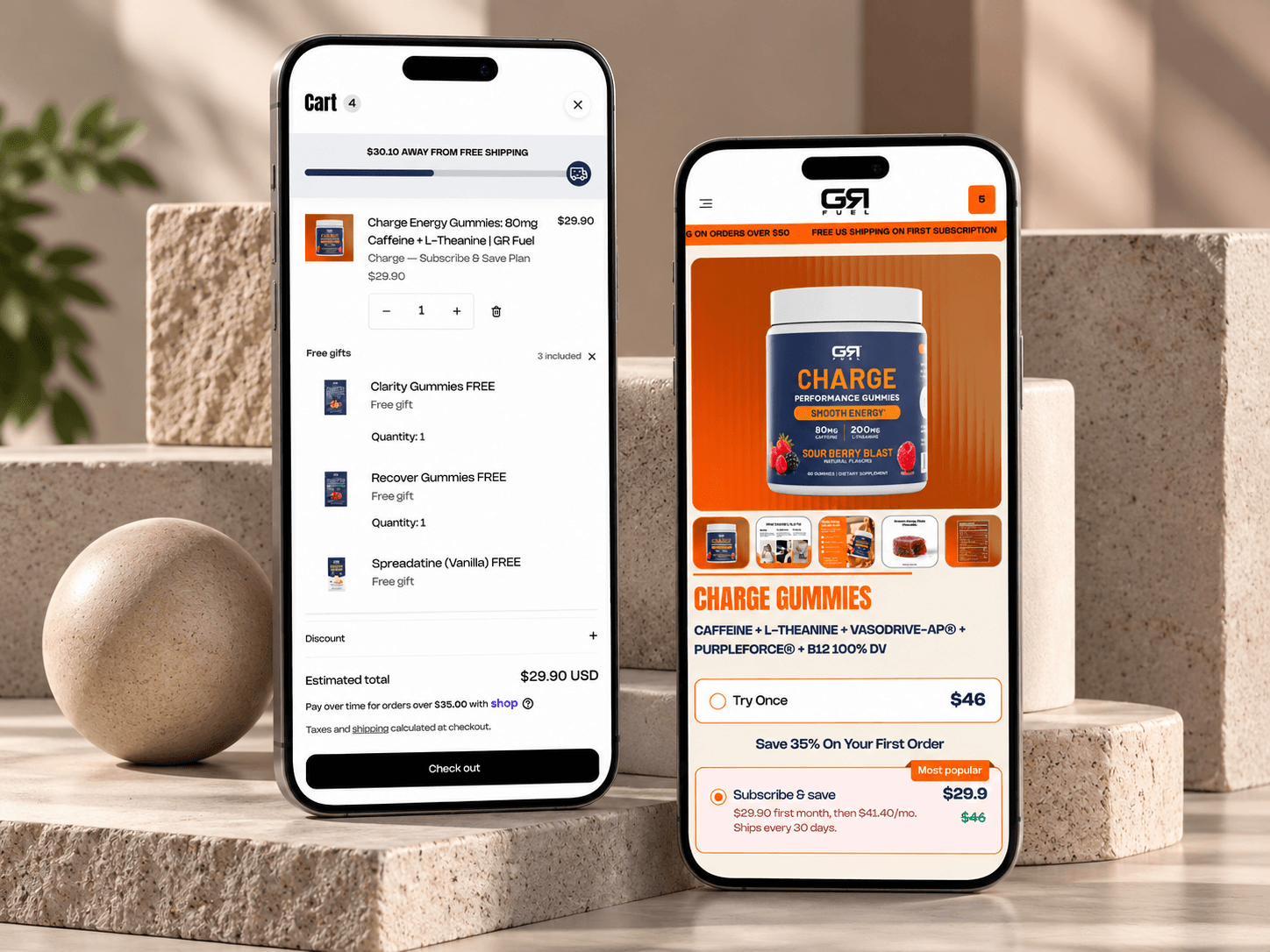
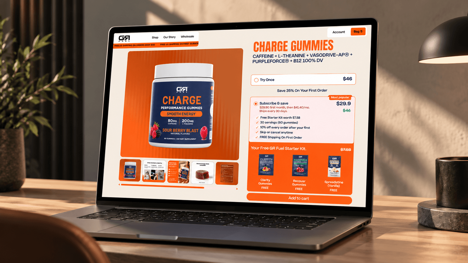
We created a vibrant, conversion-focused Shopify experience that brings GR Fuel's energetic personality and science-led product approach together. The visual direction combines bold typography, expressive product imagery, dynamic compositions, and lifestyle-focused storytelling to position the brand beyond traditional gym culture. We structured the homepage around the different ways customers use GR Fuel, from productive workdays and busy mornings to workouts and recovery. Each product experience highlights key ingredients, clearly displayed dosages, benefits, and practical use cases to help customers understand what makes each formula different. We introduced more structured product storytelling through comparison sections, ingredient breakdowns, usage instructions, FAQs, and customer reviews. Clear purchasing options and stronger calls to action help reduce friction throughout the shopping journey. The result is a distinctive storefront that makes performance nutrition feel accessible, exciting, and relevant to everyday life.
Behind the Redesign
Making everyday performance feel effortless.
Our approach was built around one idea: performance nutrition should fit into real life, not just workout routines. We focused on creating an energetic yet intuitive digital experience where bold visuals capture attention and clear product information builds confidence. By combining lifestyle-driven storytelling, transparent ingredient education, and conversion-focused UX, we made it easier for customers to discover the right GR Fuel products for their everyday needs.
A bold, energetic visual system that connects performance nutrition with everyday lifestyle moments
Clear product differentiation across Charge, Clarity, Recover, and SPREADATINE™
Transparent ingredient storytelling with visible dosages, benefits, and comparison sections
Conversion-focused product pages with intuitive purchasing options, stronger calls to action, and mobile-friendly layouts