Case study / 03
Squijoy
A full website revamp for Squishy Delights, enhancing the playful shopping experience, showcasing unique toy features, and boosting customer engagement.

Challenge
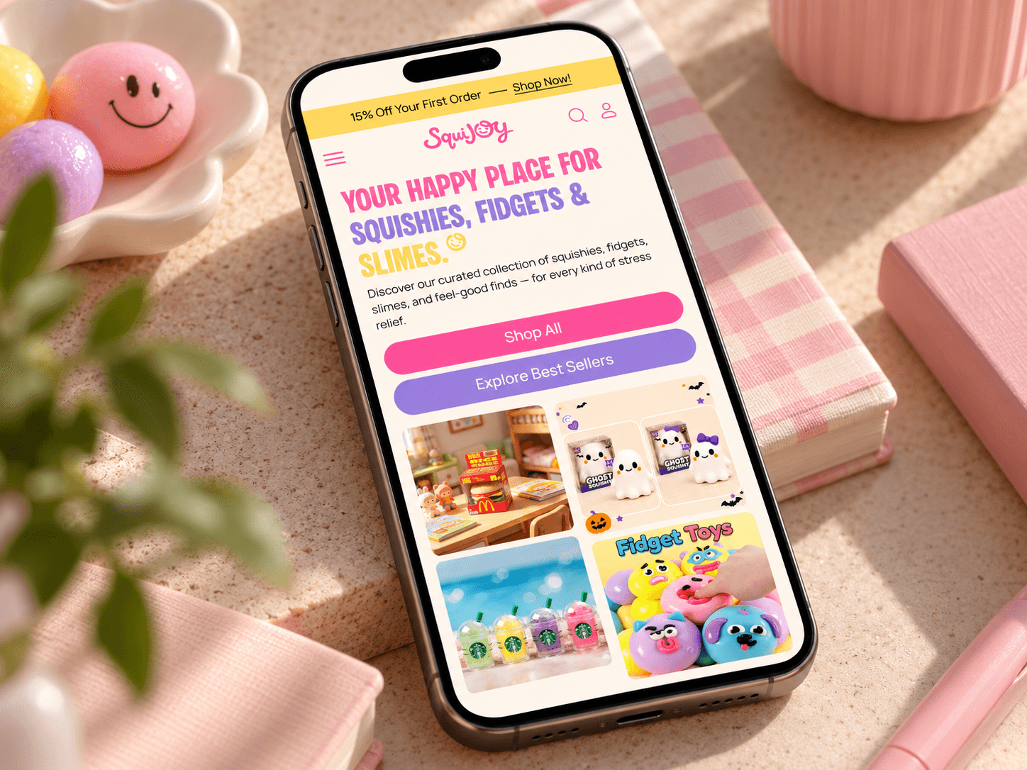
SquiJoy had a fun, colorful product range, but the website did not reflect that personality. The existing store felt very basic and wireframe-like, with little visual hierarchy, almost no brand color, and no consistent design system. Product discovery also felt flat, making it harder for shoppers to explore collections and understand what made the brand special. The logo, typography, and overall visual language lacked cohesion, so the storefront felt disconnected from the playful nature of the products. Our challenge was to create a stronger identity while making the shopping experience clearer, more engaging, and easier to navigate across desktop and mobile.
Solution
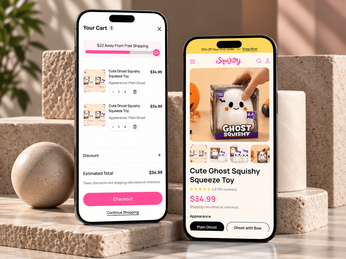
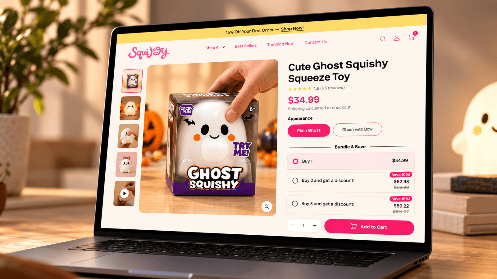
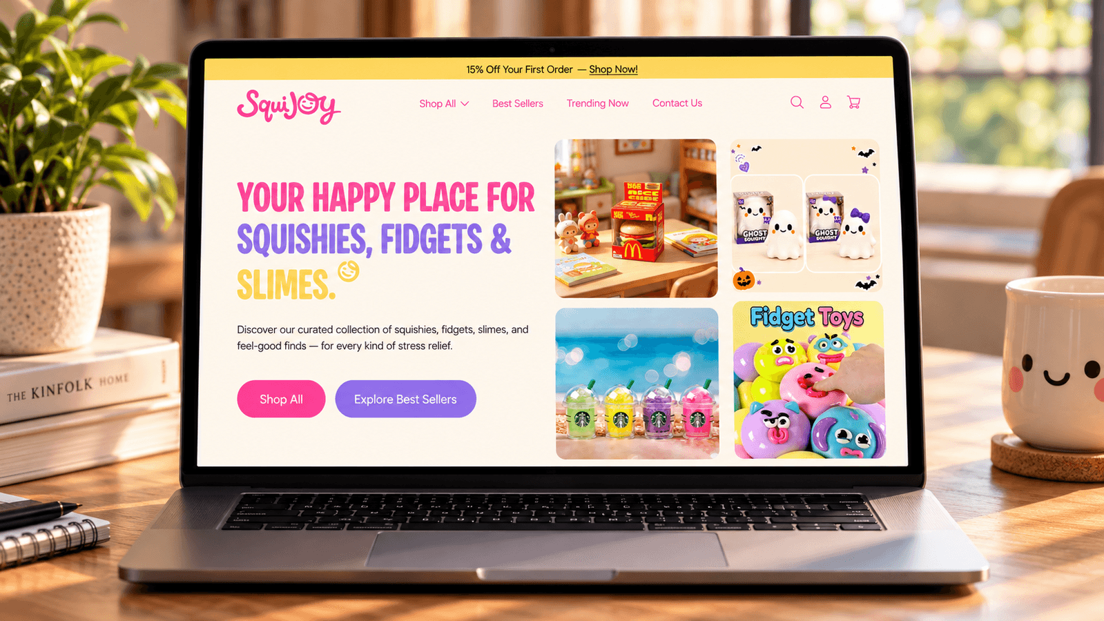
We rebuilt SquiJoy’s digital identity from the ground up, refreshing the logo, color palette, typography, and overall visual direction before applying it to the Shopify experience. The new website uses bold color, expressive type, rounded UI, and product-first layouts to make the brand feel more playful and memorable. We restructured the homepage around collections, best sellers, featured products, and social proof to make discovery easier. The design system was made consistent across sections so the store feels cohesive rather than chaotic. The result is a more recognizable, engaging, and intuitive storefront that better matches the personality of SquiJoy’s products.
Behind the Redesign
The thinking that shaped the new experience.
A brighter identity, clearer hierarchy and more structured shopping experience helped turn SquiJoy from a basic storefront into a brand-led eCommerce experience. The new direction uses playful color, expressive typography and product-first layouts to make browsing feel fun without becoming chaotic.
Stronger brand recognition through a new visual system
Product-first layouts that make browsing easier
A more consistent shopping system across desktop and mobile
Clearer hierarchy that guides customers from discovery to purchase